Ternary diagrams
Maximiliano Garnier-Villarreal
Setup
knitr::opts_chunk$set(echo = TRUE, message = FALSE, warning = FALSE)

library(plotly)
library(tidyverse)
Diagrams
This document shows how to display and use, in R, different ternary diagrams that are used regularly in geosciences, these are (diagram - function):
- QAP -
ternary_qap() - FAP -
ternary_fap() - QAP for gabbros -
ternary_qap_g() - QAP for mafic rocks -
ternary_qap_m_ol(),ternary_qap_m_hbl() - QAP for ultramafic rocks -
ternary_qap_um(),ternary_qap_um_hbl() - Dickinson diagrams for provenance -
ternary_dickinson_qtfl(),ternary_dickinson_qmflt() - AFM -
ternary_afm() - Feldspars -
ternary_feldspars() - Pyroclastic rocks -
ternary_pyroclastic_size(),ternary_pyroclastic_type() - Folk diagrams -
ternary_folk_gsm(),ternary_folk_smc(),ternary_folk_qfm(),ternary_folk_qfr() - Soil classification -
ternary_shepard(),ternary_usda()
Use
Load functions
To load all the functions at once the following command can be used:
lapply(fs::dir_ls('functions/'), source)Static
A simple static diagram without data can be obtained by just calling the respective function. The result is a ggplot2 object based on the ggtern package.
ternary_folk_qfr()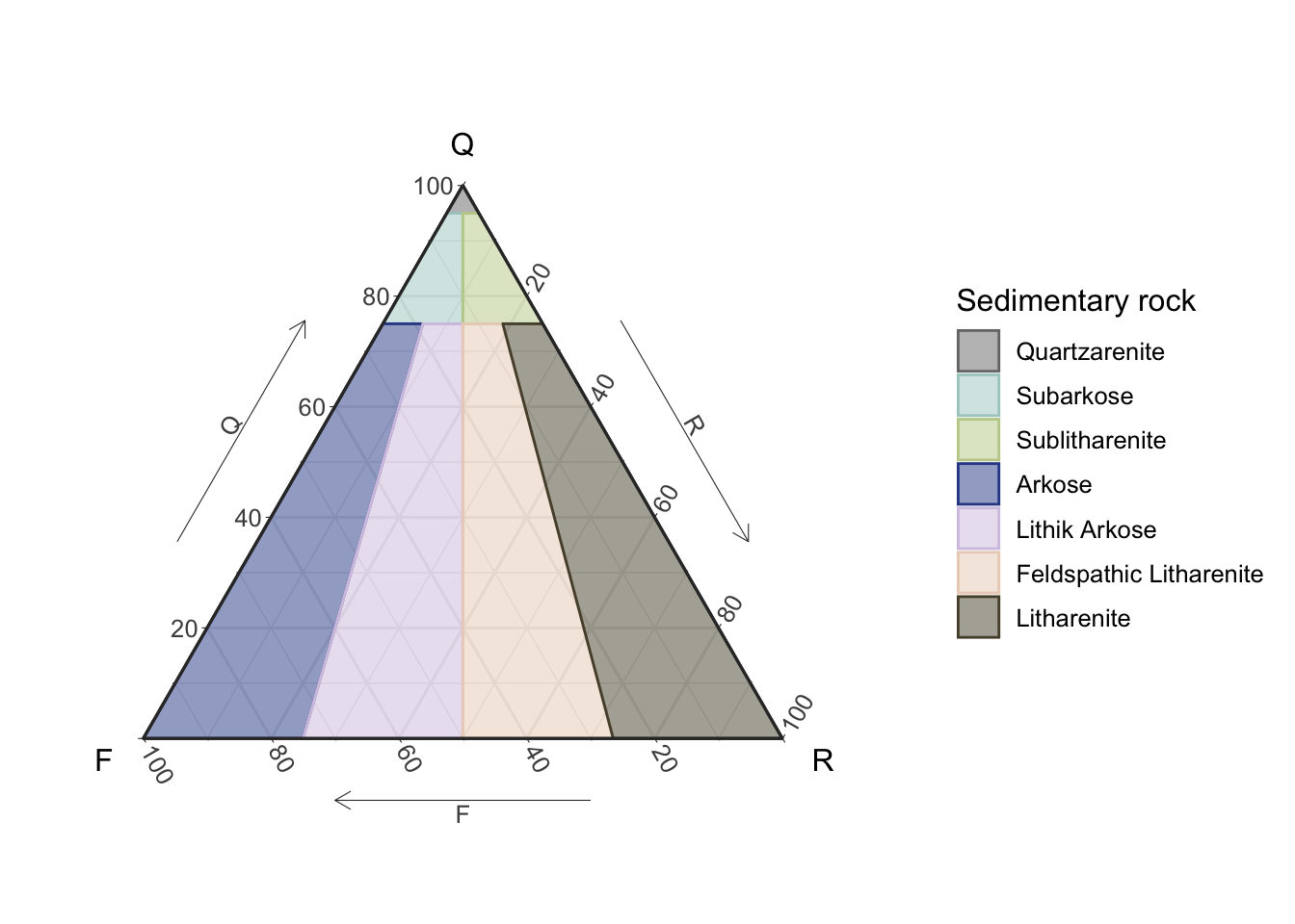
Figure 1: Static Folk ternary diagram for sedimentary rocks
Dynamic
To obtain a dynamic diagram the output argument must be set to ‘plotly’, resulting in a plotly object.
ternary_qap_m_ol(output = 'plotly')Figure 2: Dynamic QAP ternary diagram for mafic rocks
Add your data!!
To add your own data to the diagram a new table must be created (imported), where the names of the columns must match the names of the vertices for the corresponding diagram, for this check the Names section where the respective names are given for each diagram (function).
The sample (row) totals (adding the three components) are not required to add-up to 100%, this is done internally.
Adding some data is demostrated here by ploting two points in the QtFL diagram, first by ploting the data in a static diagram (ggplot2), and then ploting the same data in the dynamic diagram (plotly).
In these data the first sample (point) adds-up to a 100 but the second one does not, showing that point made above.
d = tibble(Qt=c(40,30),F=c(40,20),L=c(20,10))
d
## # A tibble: 2 × 3
## Qt F L
## <dbl> <dbl> <dbl>
## 1 40 40 20
## 2 30 20 10ternary_dickinson_qtfl() +
geom_point(data = d,
color = 'forestgreen',
size = 2,
alpha = .7)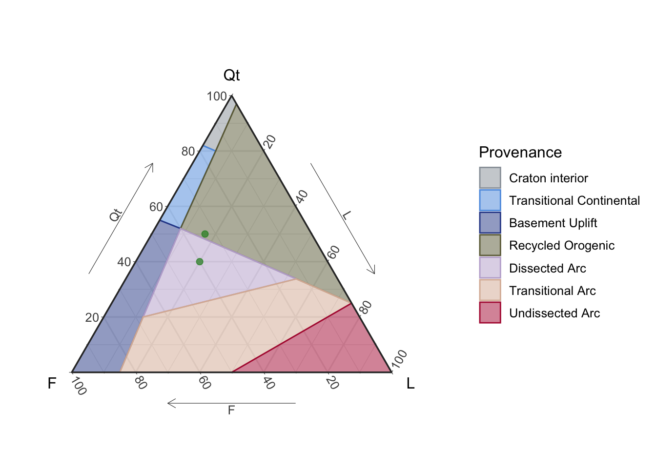
Figure 3: Static QtFL ternary diagram for provenance, with user’s data
For the plotly object (diagram) the data must be mapped in the following order: a is the top vertix, b is the bottom left vertix, and c is th bottom right vertix. The things that can be changed are the data, the name that is displayed in the legend, and the marker charcateristics; the rest is recommended not to be modified.
ternary_dickinson_qtfl(output = 'plotly') %>%
  add_trace(a = ~Qt, b = ~F, c = ~L,
            data = d,
            name = 'My data',
            marker = list(size = 8,
                          color = 'green',
                          opacity = .7),
            type = "scatterternary",
            mode = "markers",
            hovertemplate = paste0('Qt: %{a}<br>',
                                   'F: %{b}<br>',
                                   'L: %{c}'),
            inherit = F)
Figure 4: Dynamic QtFL ternary diagram for provenance, with user’s data
Names
These are the names that your data frame must have for you to be able to plot it in the corresponding diagram, corresponding to top (a), left (b), and right (c), respectively. This is more important for the ‘plotly’ output as you need to map the variables accordingly, as shown in the example above.
ternary_qap(): Q, A, Pternary_fap(): F, P, Aternary_qap_g(): P, Cpx, Opxternary_qap_m_ol(): P, Px, Olternary_qap_m_hbl(): P, Px, Hblternary_qap_um(): Ol, Opx, Cpxternary_qap_um_hbl(): Ol, Px, Hblternary_dickinson_qtfl(): Qt, F, Lternary_dickinson_qmflt(): Qm, F, Ltternary_afm(): F, A, Mternary_feldspars(): K, Na, Caternary_pyroclastic_size(): BB, Lapilli, Ashternary_pyroclastic_type(): L, G, Cternary_folk_qfr(): Q, F, Rternary_folk_qfm(): Q, F, Mternary_folk_gsm(): G, S, Mternary_folk_smc(): S, M, Cternary_shepard(): Clay, Sand, Siltternary_usda(): Clay, Sand, Silt
Español (Spanish)
Todos los diagramas se pueden generar en español, para ello es necesario usar el argumento language y ponerlo igual a ‘es’, por defecto se despliegan en inglés (‘en’). [A spanish version is available for all the diagrams, to display this version the language argument must be set to ‘es’, by default is set to english (‘en’).]
ternary_shepard(language = 'es')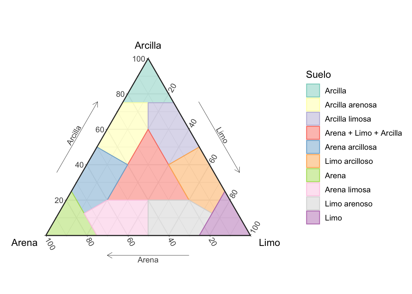
Figure 5: Diagrama ternario de Shepard para la clasificación de suelos, en español
Conclusion
This is very basic and quick introduction on how to use the ternary_* functions to plot ternary diagrams in R. Further customization of the diagramas can be achived by manipulating the ggplot2 or plotly objects, specially when adding your own data.