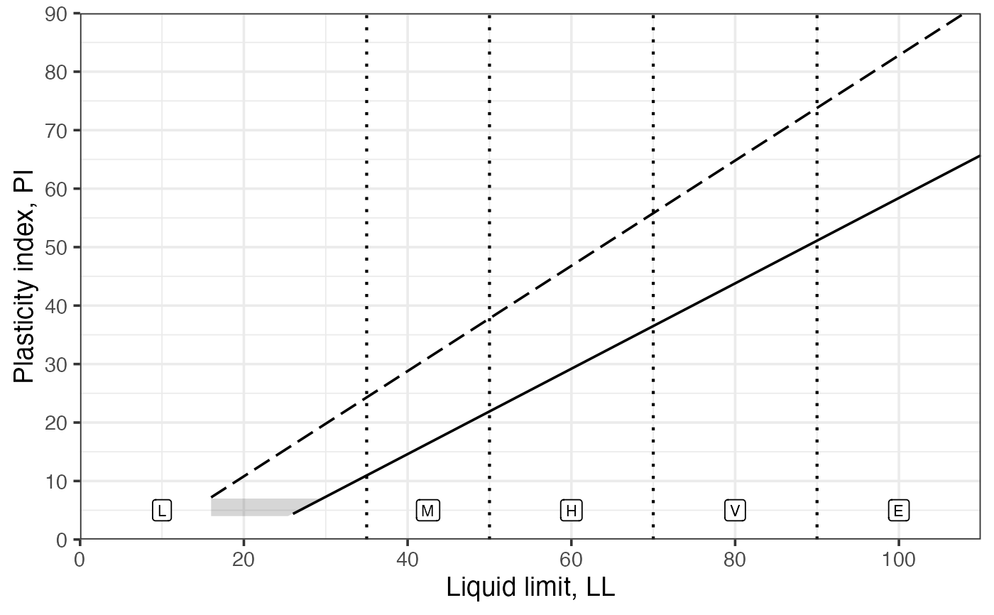
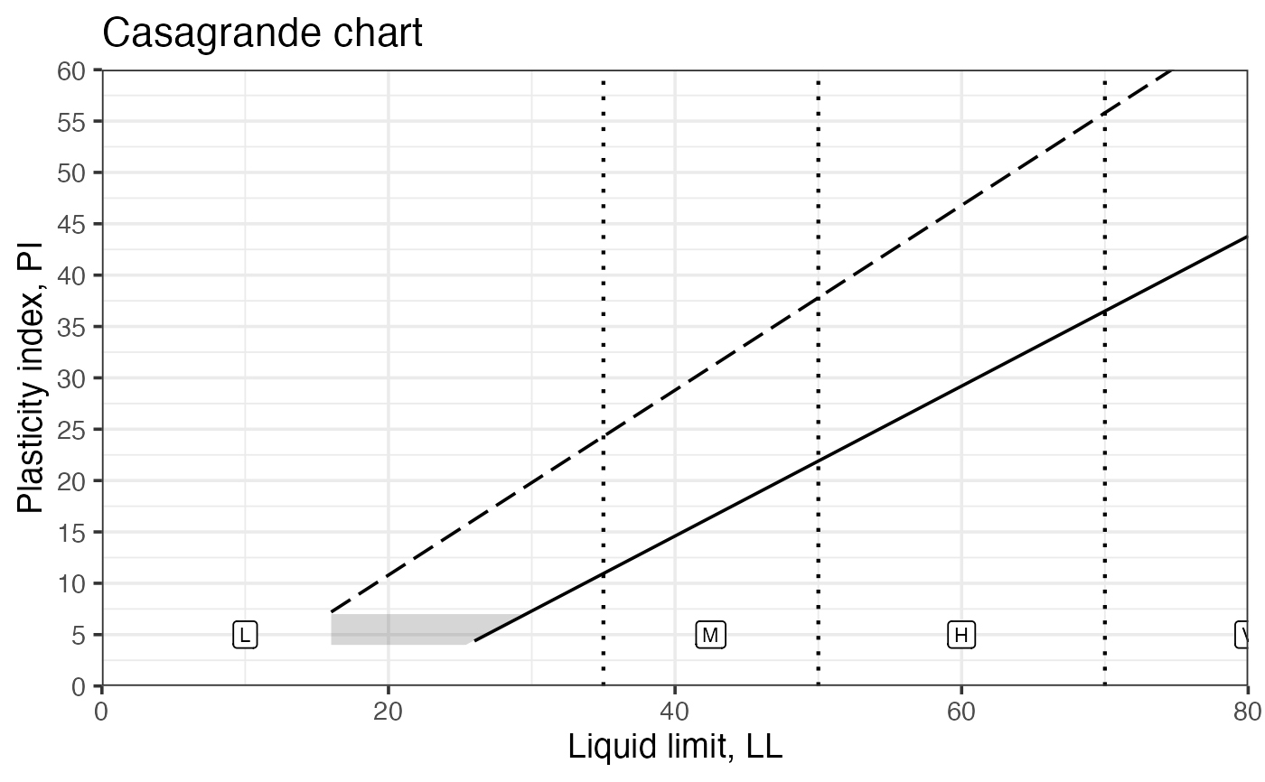
Create the Casagrande plasticity chart plotting Liquid Limit (LL) vs Plasticity Index (PI). The plot shows the A-line and U-line, a polygon representing typical classification zones, and labels for standard regions used in soil plasticity interpretation.
Details
The function computes the A-line and U-line values for LL vs PI and draws a polygon approximating the CL-ML zone. It returns a ggplot2 object so the caller can further customize the plot (titles, themes, annotations) or save it.
References
Holtz, R. D., Kovacs, W. D. & Sheahan, T. C. (2011). An Introduction to Geotechnical Engineering. Prentice Hall.
See also
Other classification plots, soil mechanics:
clay_activity(),
soil_collapse(),
soil_expansion(),
soil_swelling(),
ternary_shepard(),
ternary_usda()
Examples
Casagrande_chart()
#> Warning: Removed 42 rows containing missing values or values outside the scale range
#> (`geom_line()`).
 Casagrande_chart(ll.max = 80, pi.max = 60) + ggplot2::ggtitle('Casagrande chart')
#> Warning: Removed 42 rows containing missing values or values outside the scale range
#> (`geom_line()`).
Casagrande_chart(ll.max = 80, pi.max = 60) + ggplot2::ggtitle('Casagrande chart')
#> Warning: Removed 42 rows containing missing values or values outside the scale range
#> (`geom_line()`).
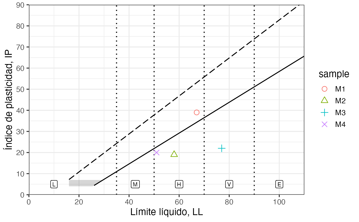
 soil_df = data.frame(ll = c(67, 58, 77, 51),
pi = c(39, 19, 22, 20),
sample = paste0('M', 1:4))
Casagrande_chart(lang = 'es') +
ggplot2::geom_point(ggplot2::aes(ll, pi, shape = sample, color = sample), soil_df, size = 3) +
ggplot2::scale_shape_manual(values = 1:4)
#> Warning: Removed 42 rows containing missing values or values outside the scale range
#> (`geom_line()`).
soil_df = data.frame(ll = c(67, 58, 77, 51),
pi = c(39, 19, 22, 20),
sample = paste0('M', 1:4))
Casagrande_chart(lang = 'es') +
ggplot2::geom_point(ggplot2::aes(ll, pi, shape = sample, color = sample), soil_df, size = 3) +
ggplot2::scale_shape_manual(values = 1:4)
#> Warning: Removed 42 rows containing missing values or values outside the scale range
#> (`geom_line()`).