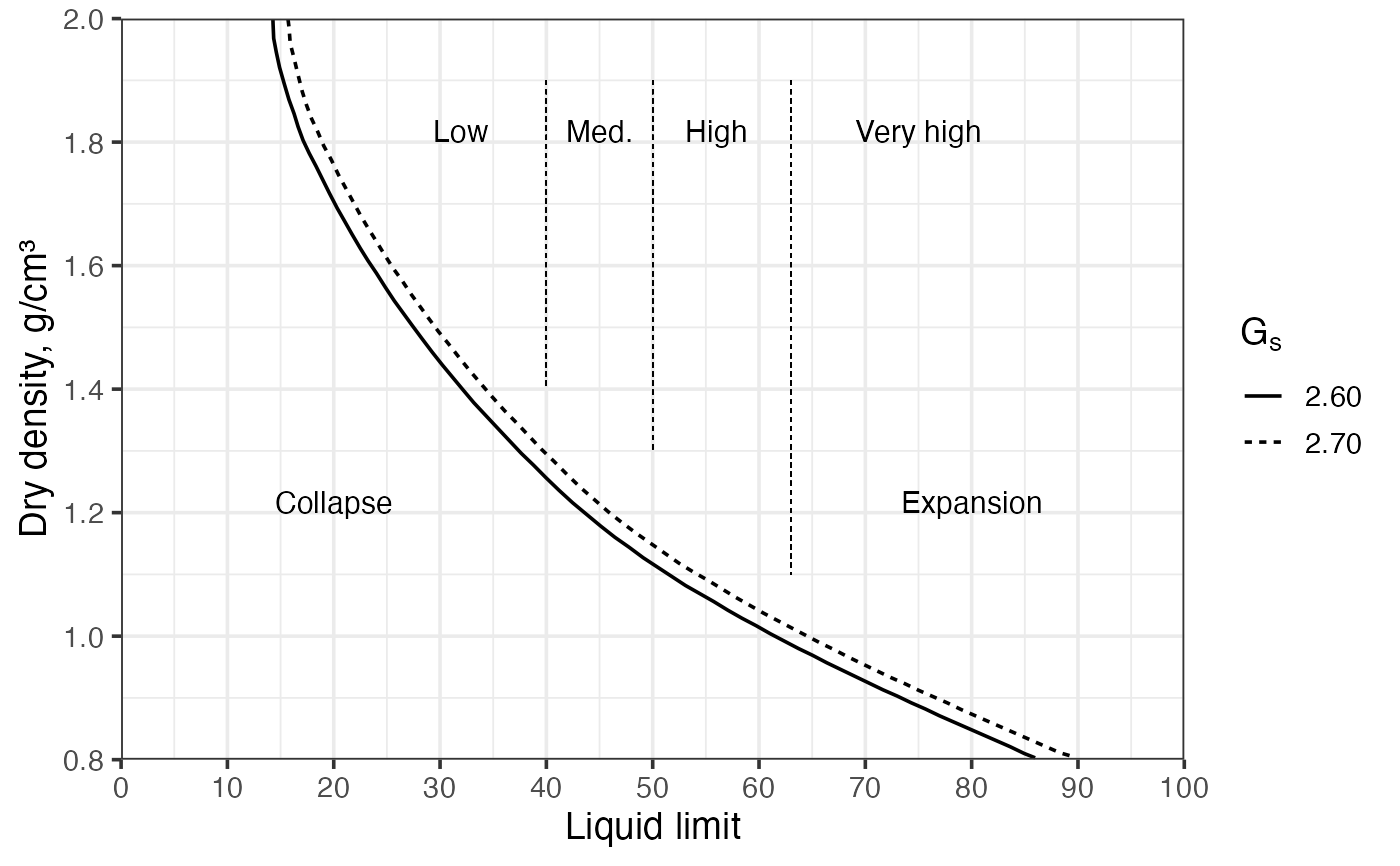
Draws a soil collapse and expansion potential chart—dry density vs liquid limit—with two boundary curves separating zones of collapse and expansion potential (low, medium, high, and very high). The boundary curves are drawn; three vertical dashed reference lines are drawn at liquid limits of 40, 50, and 63. Each zone is labelled directly on the chart.
Value
A ggplot object with liquid limit on the x-axis and dry
density on the y-axis, containing the two boundary
curves, three dashed reference lines at LL = 40, 50, and 63, and zone
labels ("Collapse" / "Expansion").
References
Holtz, R. D., Kovacs, W. D., & Sheahan, T. C. (2023). An Introduction to Geotechnical Engineering (3rd ed.). Pearson Education.
See also
Other classification plots, soil mechanics:
Casagrande_chart(),
clay_activity(),
soil_expansion(),
soil_swelling(),
ternary_shepard(),
ternary_usda()
Examples
# English labels (default)
soil_collapse()
 dat = data.frame(
ll = c(20, 40, 60, 80),
dry = c(1.5, 1.15, 1.2, 1.0),
loc = c("A", "B", "C", "D")
)
# Spanish labels
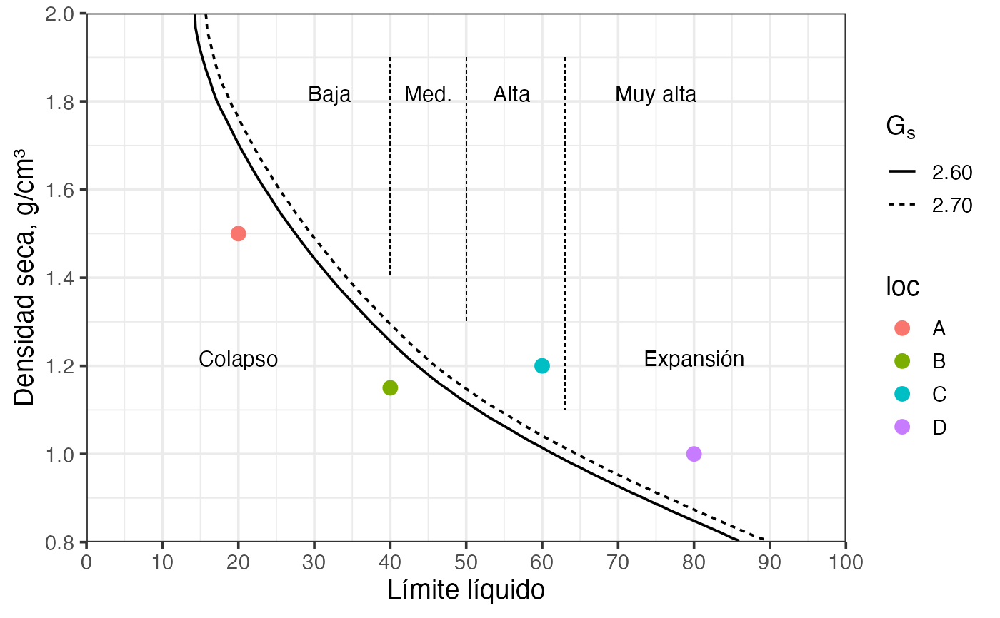
soil_collapse(lang = "es") +
ggplot2::geom_point(data = dat,
ggplot2::aes(x = ll, y = dry, color = loc),
size = 3,
inherit.aes = FALSE # needed
)
dat = data.frame(
ll = c(20, 40, 60, 80),
dry = c(1.5, 1.15, 1.2, 1.0),
loc = c("A", "B", "C", "D")
)
# Spanish labels
soil_collapse(lang = "es") +
ggplot2::geom_point(data = dat,
ggplot2::aes(x = ll, y = dry, color = loc),
size = 3,
inherit.aes = FALSE # needed
)